Bayer Plus: Rewards
Role
Timeline
Skills
Tools
Business Impact
90% Faster
Time to Market
9 Countries
~12K
2 M
Shippers Scanned
1.4M
1.6B€
Project Overview
Bayer Rewards Plus is a track & trace application tailored for Bayer Channel Partners & Advisors, aimed at enhancing engagement and sales. My role as a UX Designer involved creating a rewards redemption module within the application to facilitate seamless reward point tracking and redemption.
The goal was to foster trust among partners, increase sales, and provide a frictionless experience at the point of purchase.
Business Challenges
01
Lack of Transparency:
Existing process lacked systematic approach for tracking and utilising reward points for Bayer Partners
and Advisors.
02
Absence of a System:
Lack of rewards redemption system hindered sales and failed to effectively incentivize partner engagement.
03
Market Potential:
Bayer aimed to analyse market potential to devise strategies for increasing sales of agricultural products.
Opportunities
To address these challenges and bolster customer retention, our team opted to develop a dedicated rewards redemption module within the application. The represented the opportunity with the help of ‘Hooked Model’.
Trigger
Whenever a user made a purchase, points based on his purchase amount was stored in his Wallet.
Action
The accumulated points prompted the user to redeem rewards from partnered businesses.
Variable Reward
The rewards often consisted an array of different products such as coupons, gift cards and subscriptions
Investment
This encouraged repeated purchases and reward redemption further cultivating customer loyalty.
User Flow
01
Scan Out
User scans out the product through Advisor Sales capability to a Farmer.
02
Reward Points
He earns reward point for each scan out. These are accumulated in his App Wallet.
03
Catalogue Surfing
User browses through the catalogue of rewards consisting coupons, gift cards.
04
Redemption
User redeems the coupon of his interest with the available points.
05
Feedback
User receives redeemed coupon link to his registered email and phone number.
06
Purchase
User utilises the redeemed coupon to make purchase at his preferred store.
Iterations
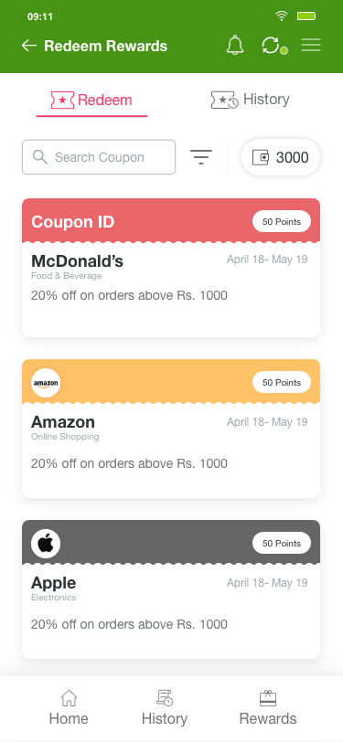
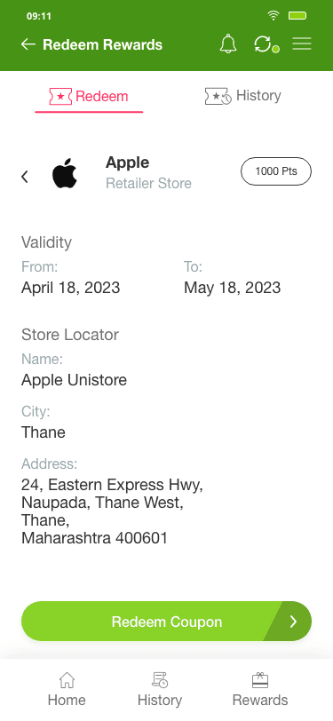
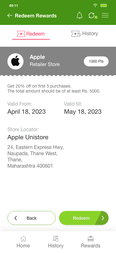
Before finalising on one concept and flow, the design went through various iterations:
Catalogue Screen
Details Screen
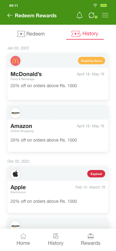
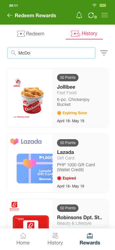
History Screen
Final Screens
The created application introduced several key features and improvements:
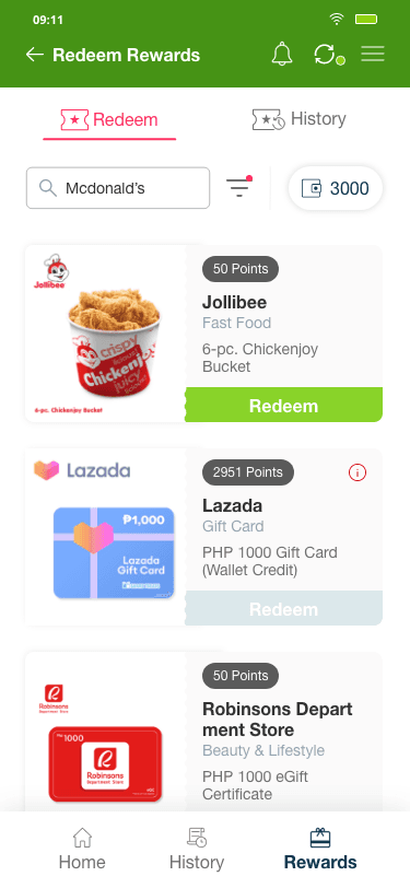
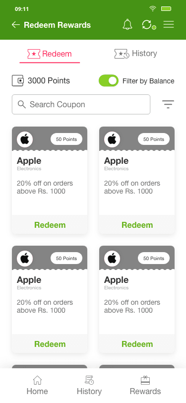
Catalogue Screen
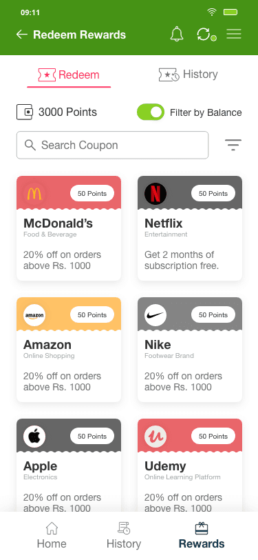
Users primarily wanted to scroll through options based on brand store, description, category type, with the number of points needed for redemption being the top priority.
Easy of Use > Search Bar
Information Accessibility > Wallet Balance
Visual Signifier > Disabled ‘Redeem’ Action
Efficiency > Filter
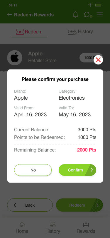
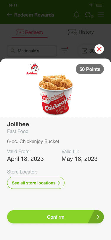
Reward Details Pop-up
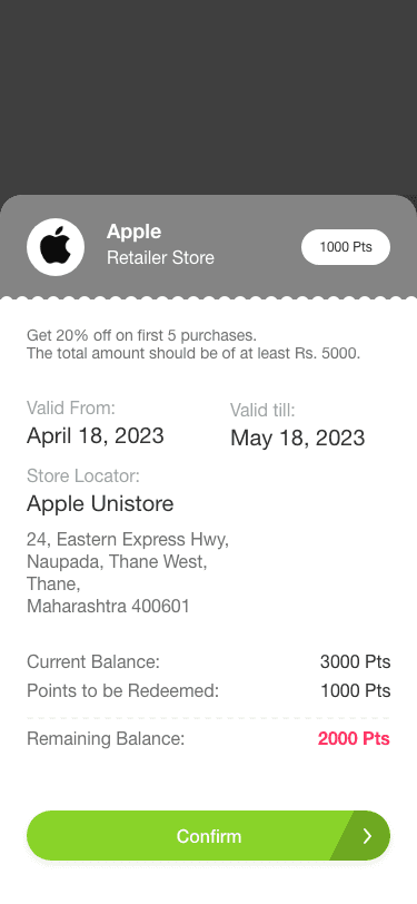
After tapping ‘Redeem’, users prioritise reward validity and store redemption details on the subsequent screen.
Information Visibility > Reward Validity
Information Accessibility > Store Location
Efficient Navigation > ‘Confirm’ CTA
History Screen
All redeemed rewards are stored in the History Screen, enabling users to track them and view rewards that are expiring soon.
Information Visibility > Reward Expiry and Validity
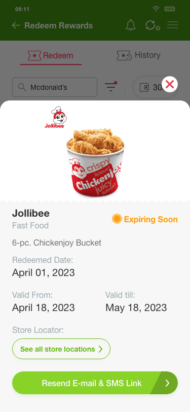
Redeemed Reward Details Pop-up
This screen helps users resend the email and SMS link needed to use the coupon at stores, useful if they accidentally deleted the link or never received it.
Information Retrieval > Resend Link CTA
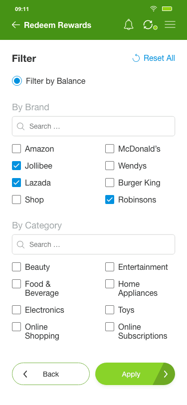
Filter Screen
Users can filter their rewards options by wallet balance, brands, and categories, reducing decision fatigue and streamlining the process of finding relevant rewards.
Ease of Use > Filter by Balance
Efficiency > Filter by Brand and Category
