Customer Lite: Sales Redesigned
Role
Timeline
Skills
Tools
Project Overview
The goal of this project was to create a lite version of the existing Customer Plus application, specifically tailored for countries where Salesforce certification is invalid.
Additionally, the aim was to facilitate digital transformation for Bayer Salespeople, leading to cost optimisation.
Objective
The original version of the Customer Plus app required a Salesforce license, incurring additional expenses.
The redesign aimed to provide sales reps with access via smartphones and tablets to a selected set of features, enhancing the user experience while reducing license costs.
End Users
Sales Representative
• As Field workers ‘Accessibility’ will be crucial, considering situational disabilities.
• Their job involves managing and tracking customer accounts.
• Lack of internet access on the field, might promote accessing the app offline.
UX Audit
During the research phase, a thorough UX Audit was conducted, uncovering critical insights:
• Information Segregation
Overwhelming amount of information leading to decision-making delays and inefficiencies.
• Progress Visibility
Users lack clarity on the number of steps and their current progress, leading to confusion and memory recall issues.
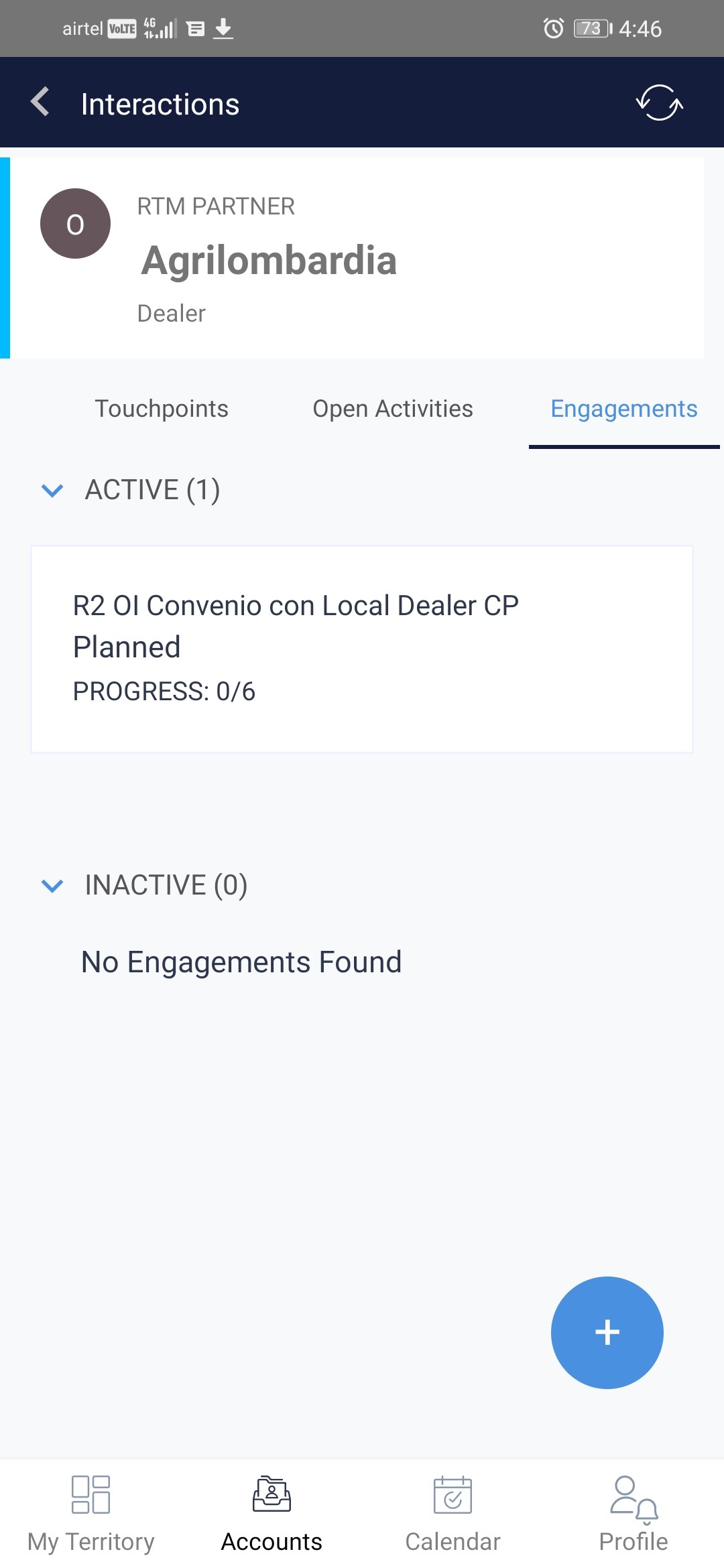
• Vertical Space Optimization
Inadequate use of vertical space can impact responsiveness across devices like tablets and mobiles.
• Alignment Issues
Inconsistent alignment of content elements causes visual discomfort and disrupts the overall interface coherence.
• Optimizing Buttons
The use of different colors for CTAs without distinguishing priority levels, leads to difficulty in identifying high-priority actions.
Problem Analysis > Solution Ideation
Too much information causing cognitive overload
Keeping content succinct and clustering data to avoid redundancy.
Poor visibility of progress during actions
Incorporating a faster feedback mechanism to make action progress visible.
Non-responsive content across devices
Taking Mobile-first approach for designing screens
Improper alignment among elements and layouts disrupting seamless navigation
Optimizing alignments between elements and layouts for effective navigation
Errors due to disconnect between affordances and signifiers
Correcting the relationship between signifiers and affordances
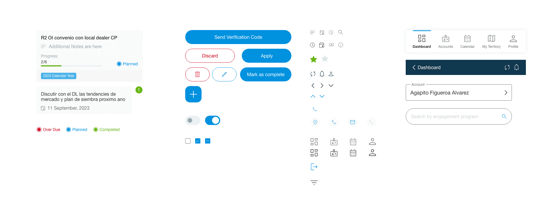
Design System

Material 3
Design Iteration
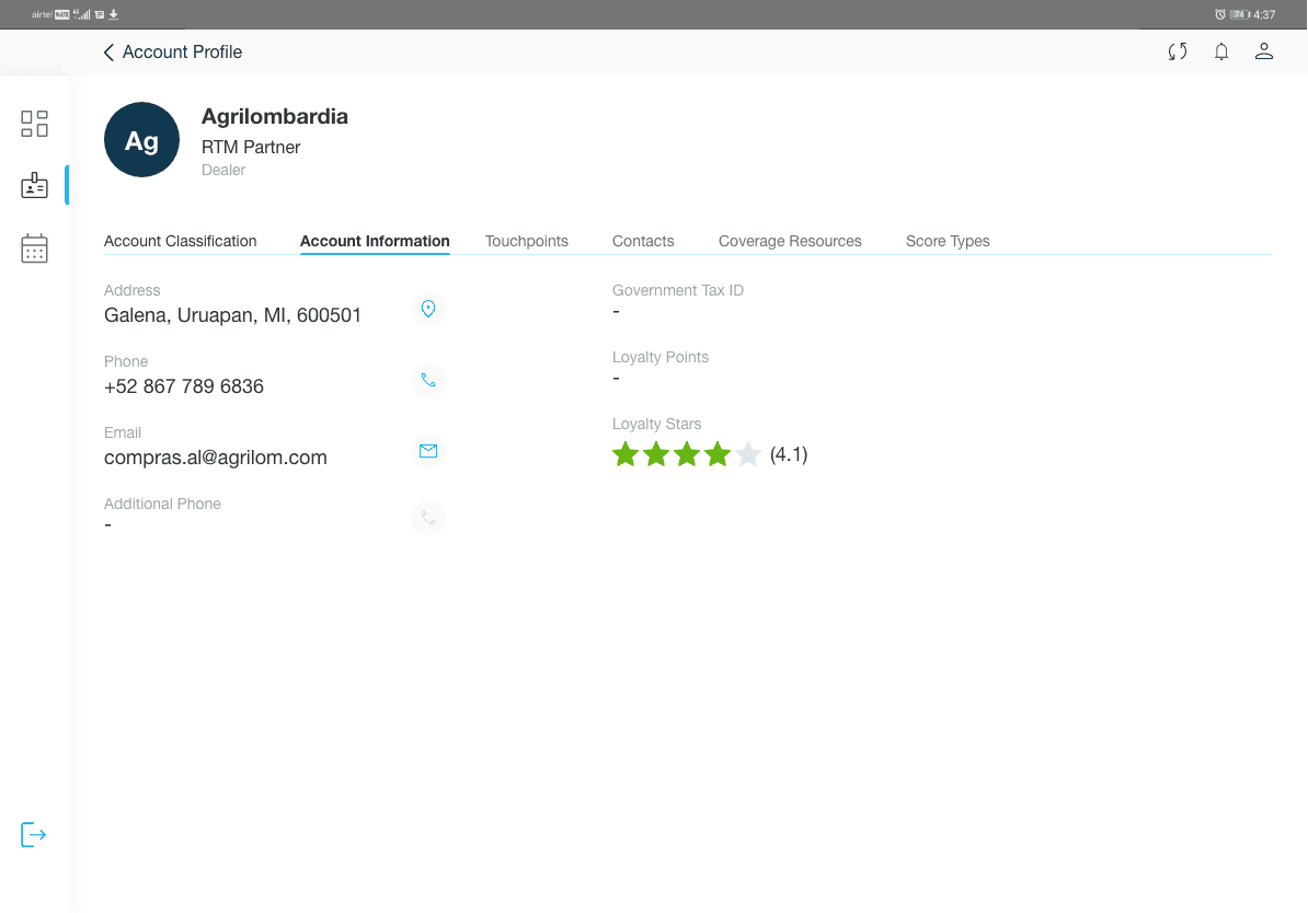
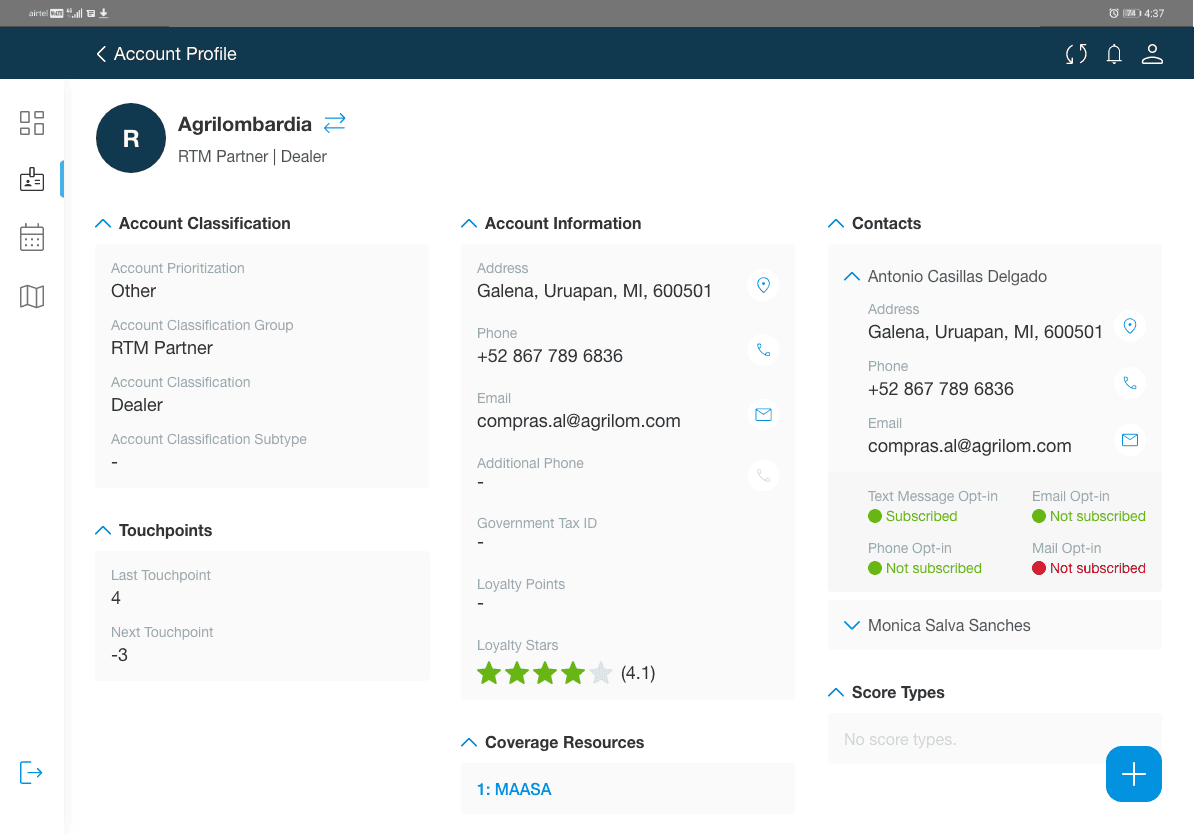
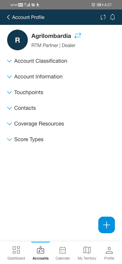
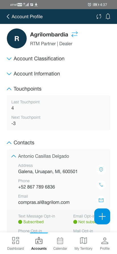
Initially, we explored using ‘Tab Structure’ to minimise displayed information, but after Formative User Testing, we opted for an accordion style, favoured for simplicity, displaying data at once, reducing taps for navigation.
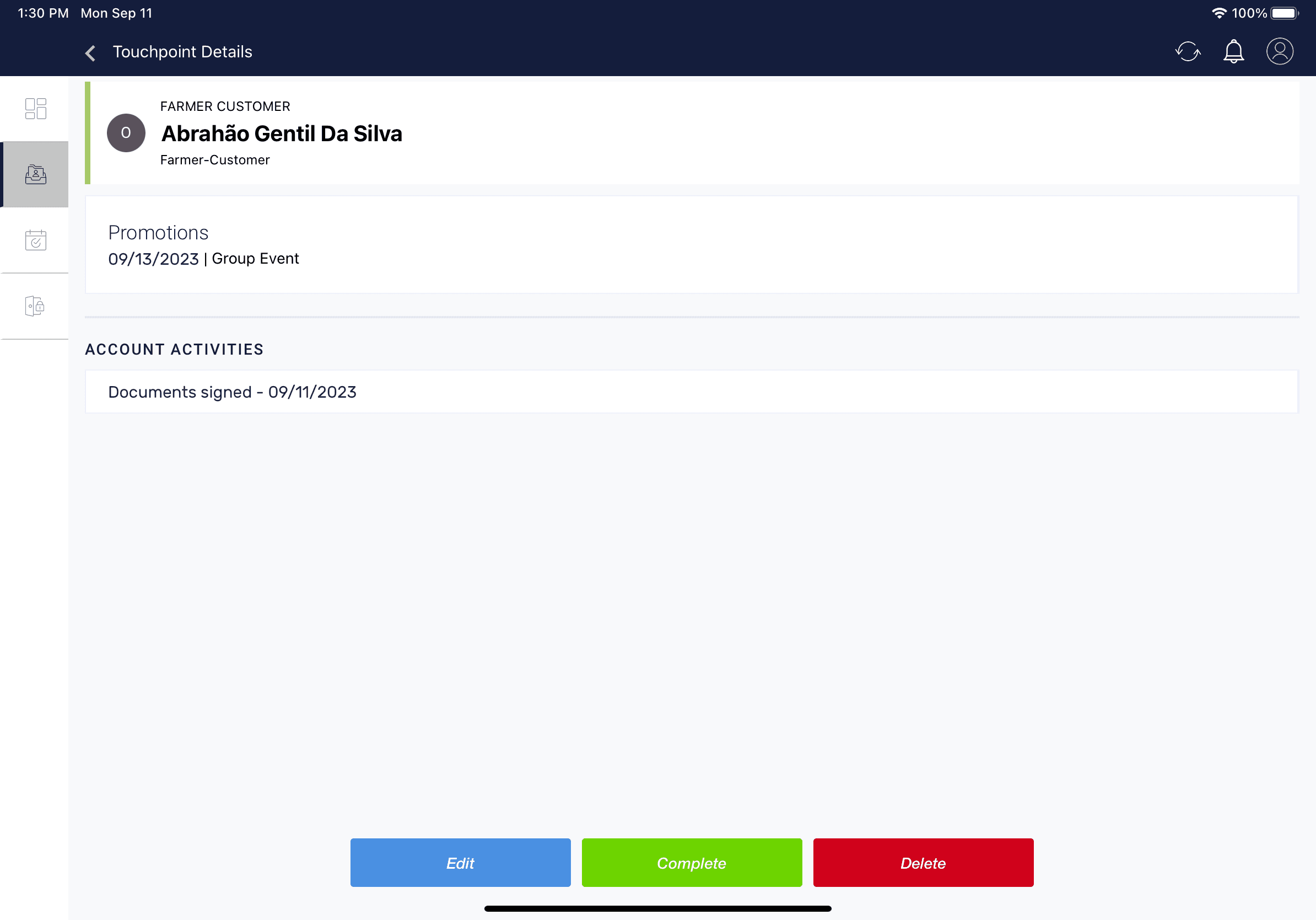
Existing
With Tabs
Final
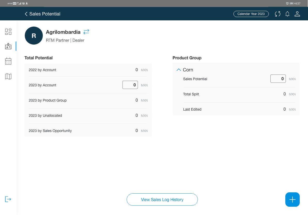
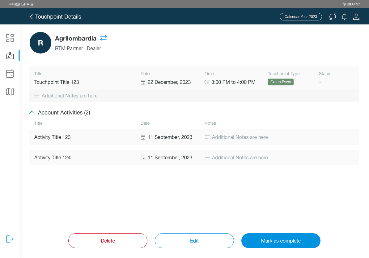
Final Design- Tablet
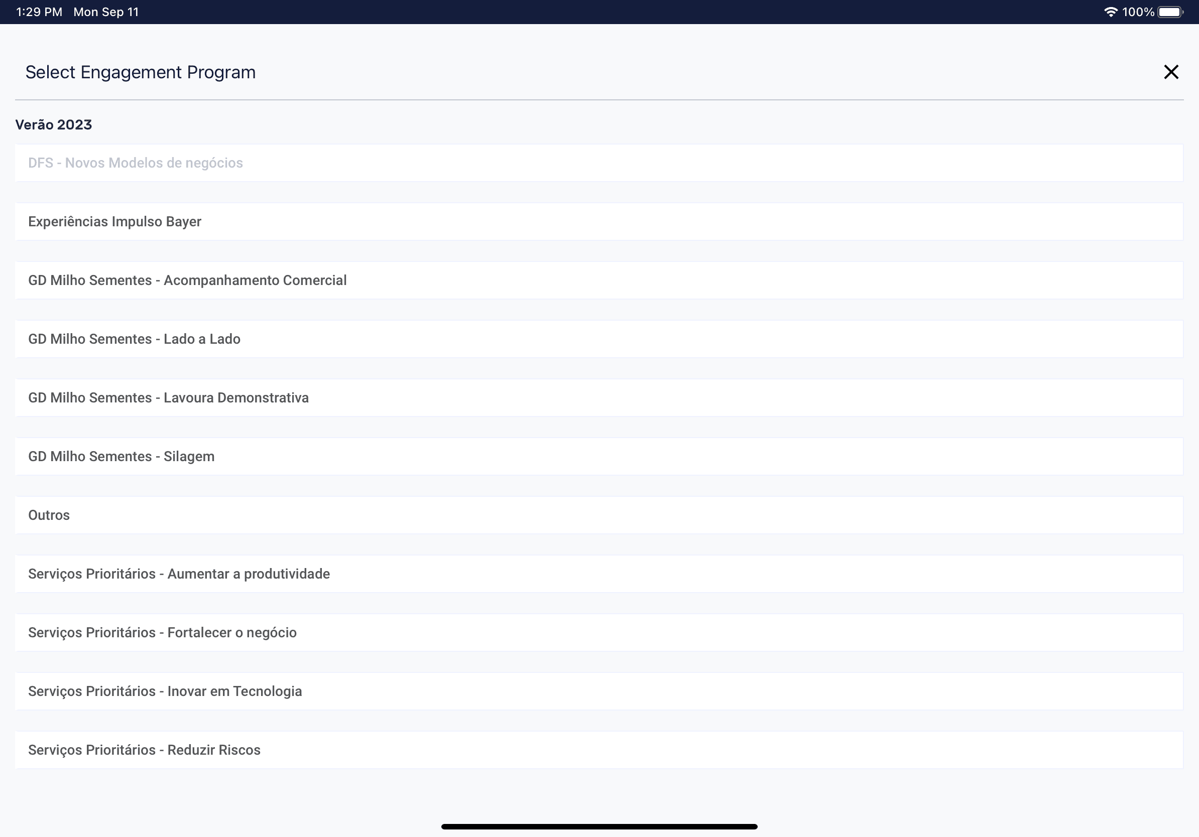
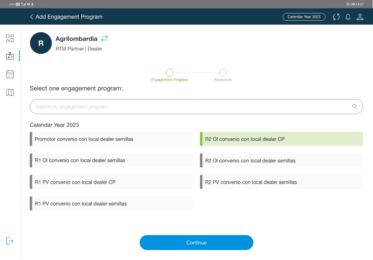
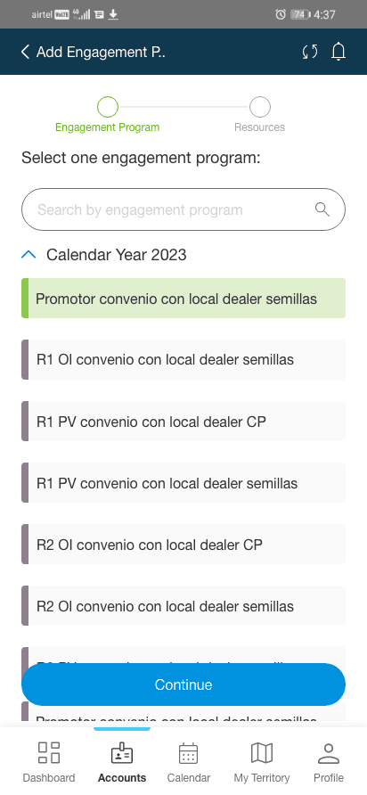
Search by Engagement Program
Aided efficient data retrieval, reducing cognitive load in an information heavy screen.
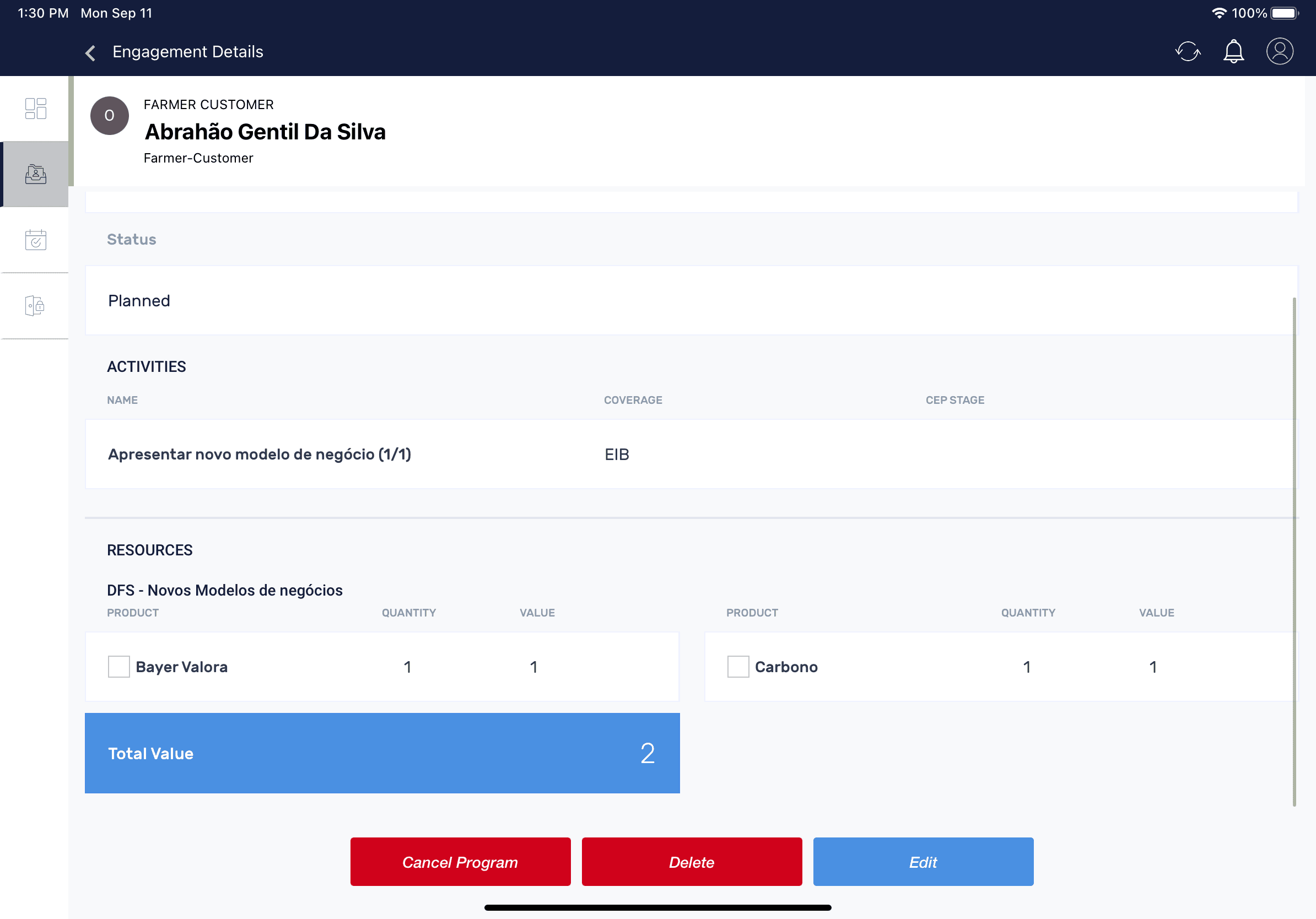
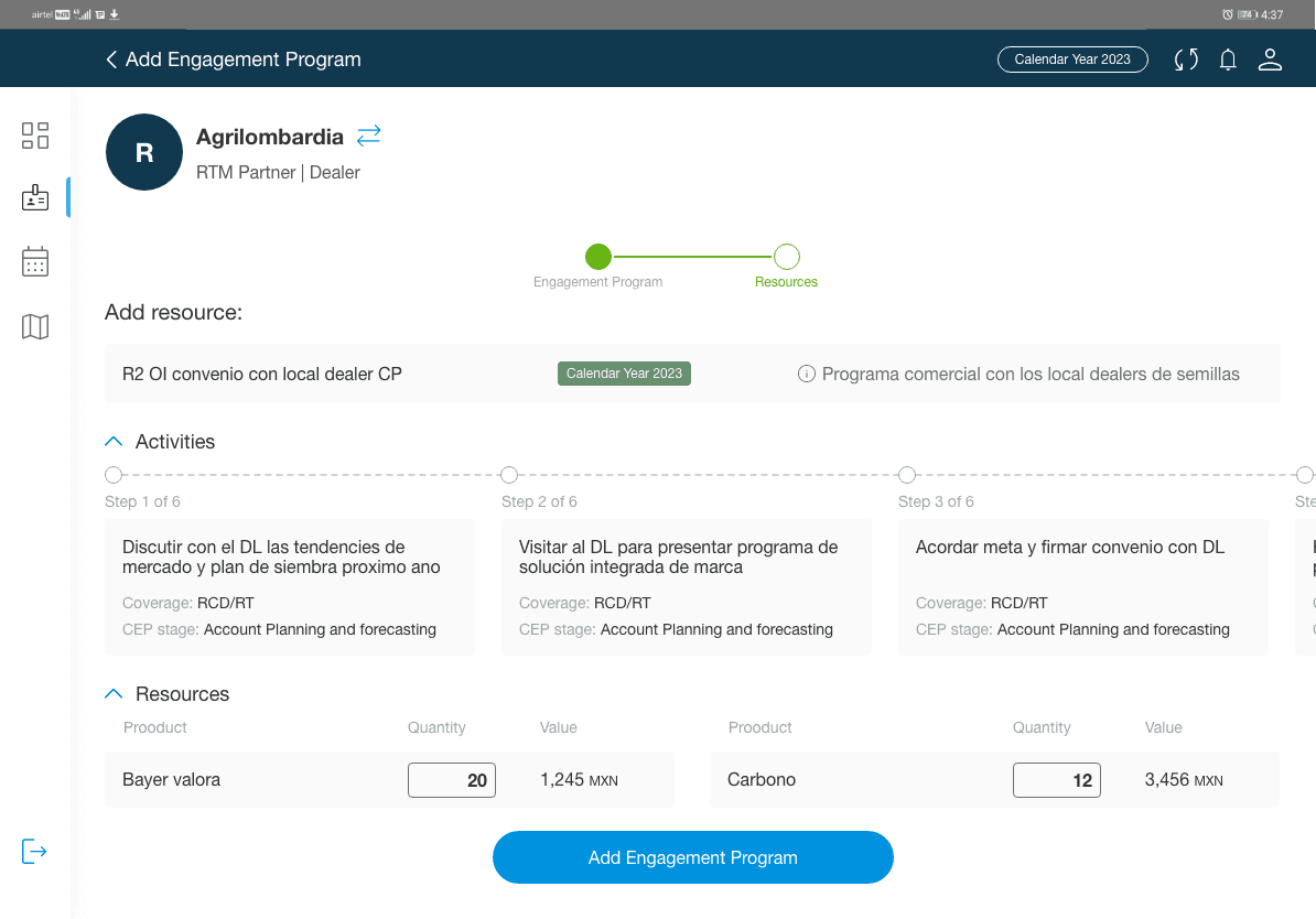
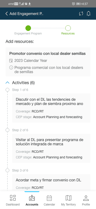
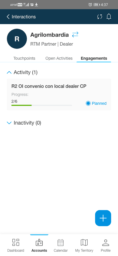
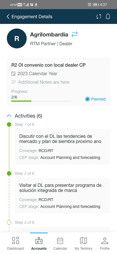
Step Progress Indicator
Offered clear guidance by providing users with a visual roadmap of their current position in the process and next steps, enhancing navigation in completing tasks efficiently.
Space Optimisation
Aided responsiveness by ensuring efficient use of screen real estate, faster loading times and improved readability.
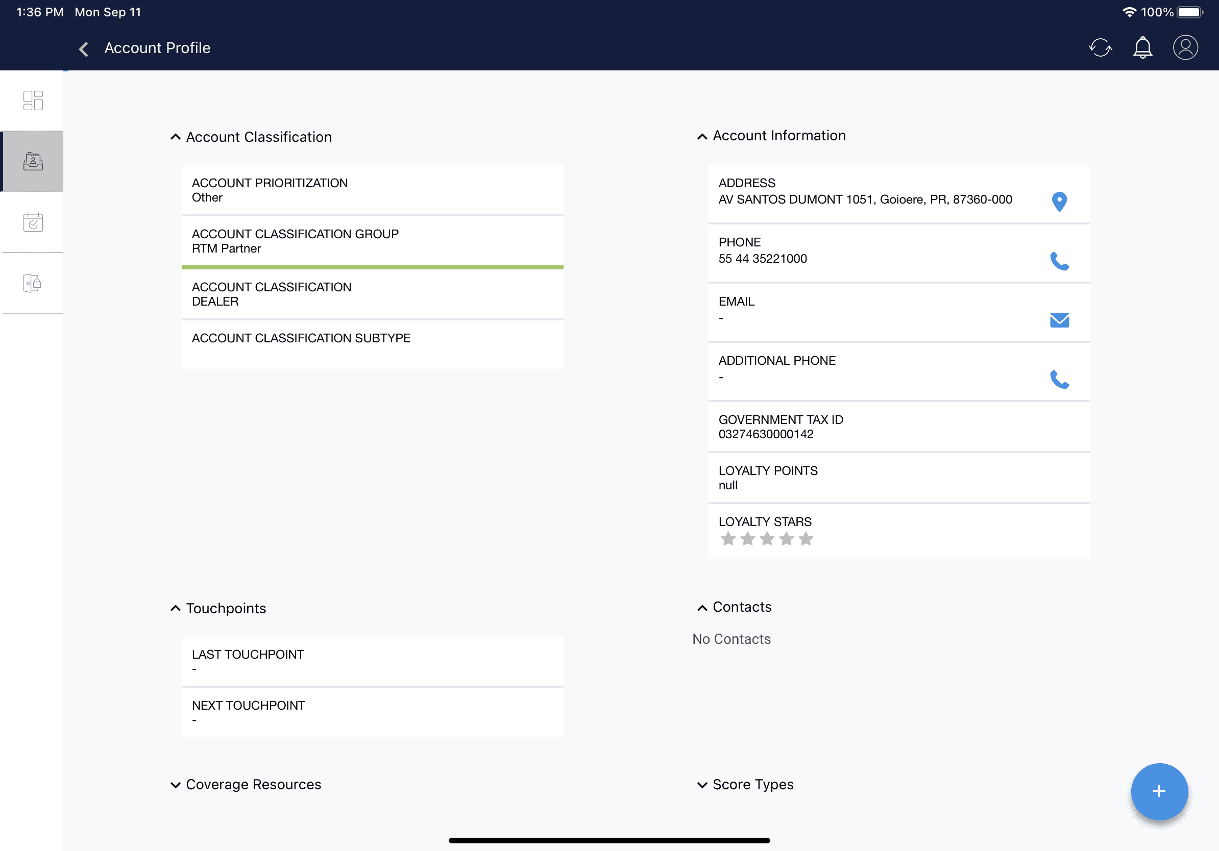
Consistent Alignment
Contributed by ensuring that elements are visually connected and organized logically, leading to a more unified experience.
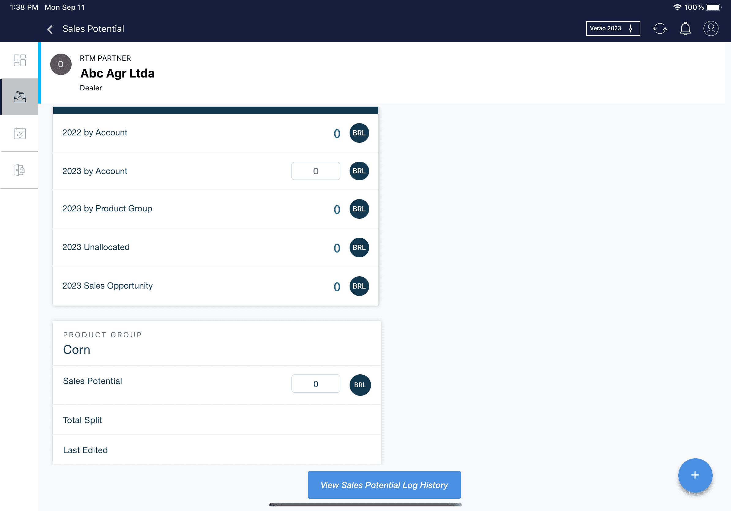
Distinguishing Priority Levels in CTAs
Captured user’s attention to important actions, encouraging them to take desired actions more promptly and effectively.
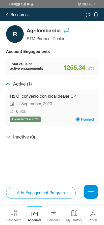
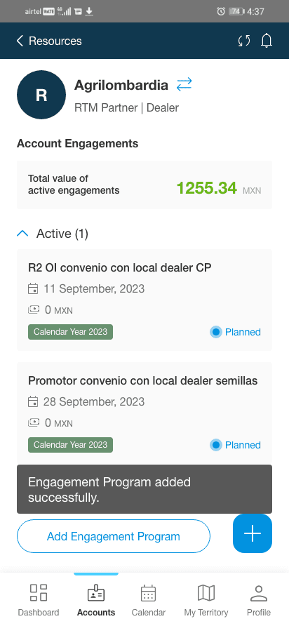
Final Design- Mobile
Engagement Planning Flow
Progress Indicator for seamless navigation
Before
After
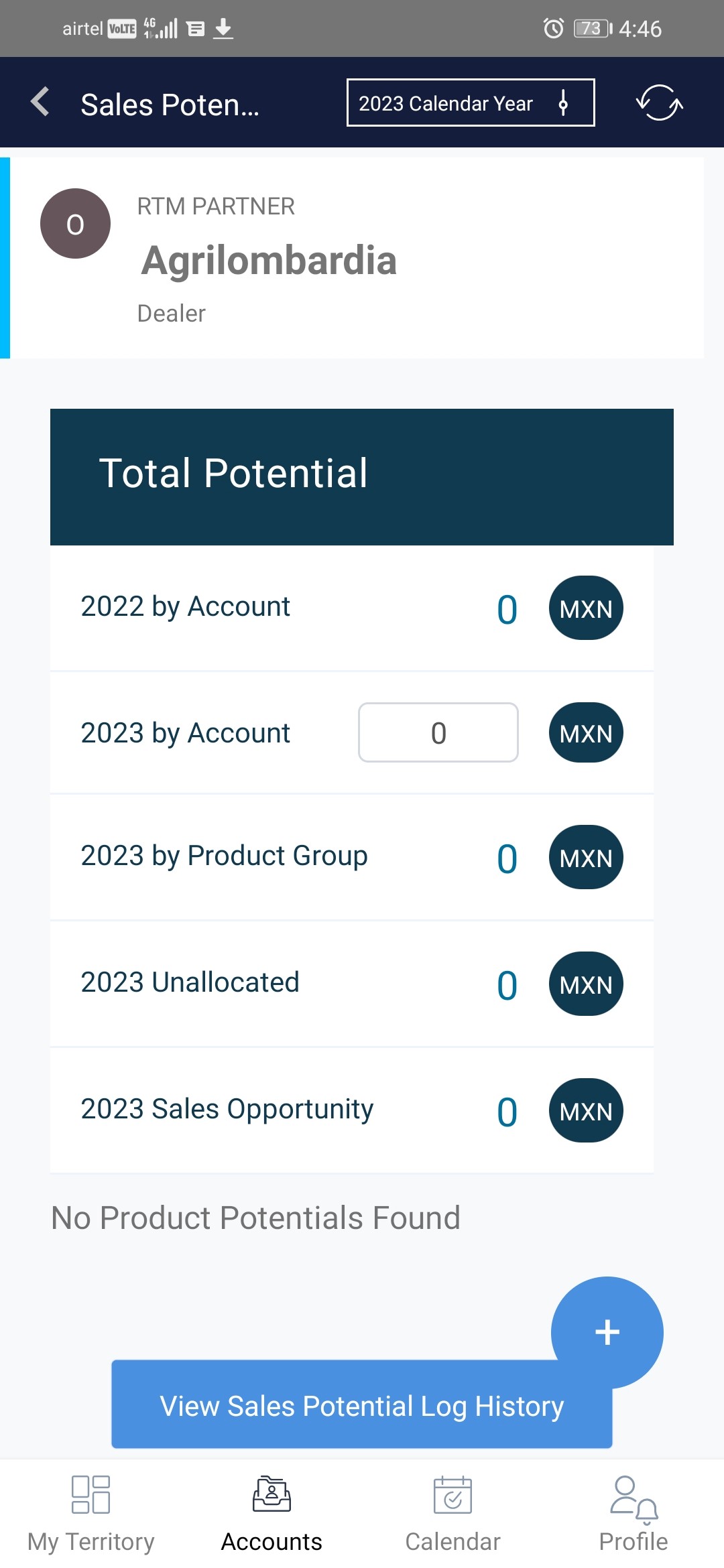
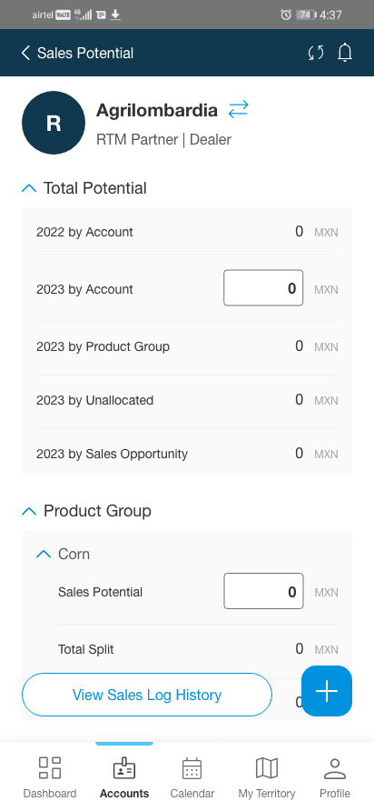
Optimising layout to enhance responsiveness
Before
After
Alignment refinement for a cohesive and uniform UX
Before
After
Correcting the relationship between signifiers and affordances.
Outcomes
Post-deployment evaluation revealed:
Ease of Use
Users felt comfortable and expressed the UI was much more Simplified.
Cost Effective
Cost savings achieved by eliminating the need for Salesforce license.
Easier Adoption
New User experience was adopted and maintained without compromise.

